
Hey @jmcelroy.bsky.social, new Saturna Island flag dropped. Old version above, new version below. Opinions?

Hey @jmcelroy.bsky.social, new Saturna Island flag dropped. Old version above, new version below. Opinions?

Love it. Recognized that iconic building right away.

This should tick Justin's "crests don't belong on flags" box.

I really like it

Yes.

the pint tho :(
about 1000% better nice work someone!

Ain't no Burnaby but still pretty dope

Wow, that's amazing and it breaks almost every flag convention!
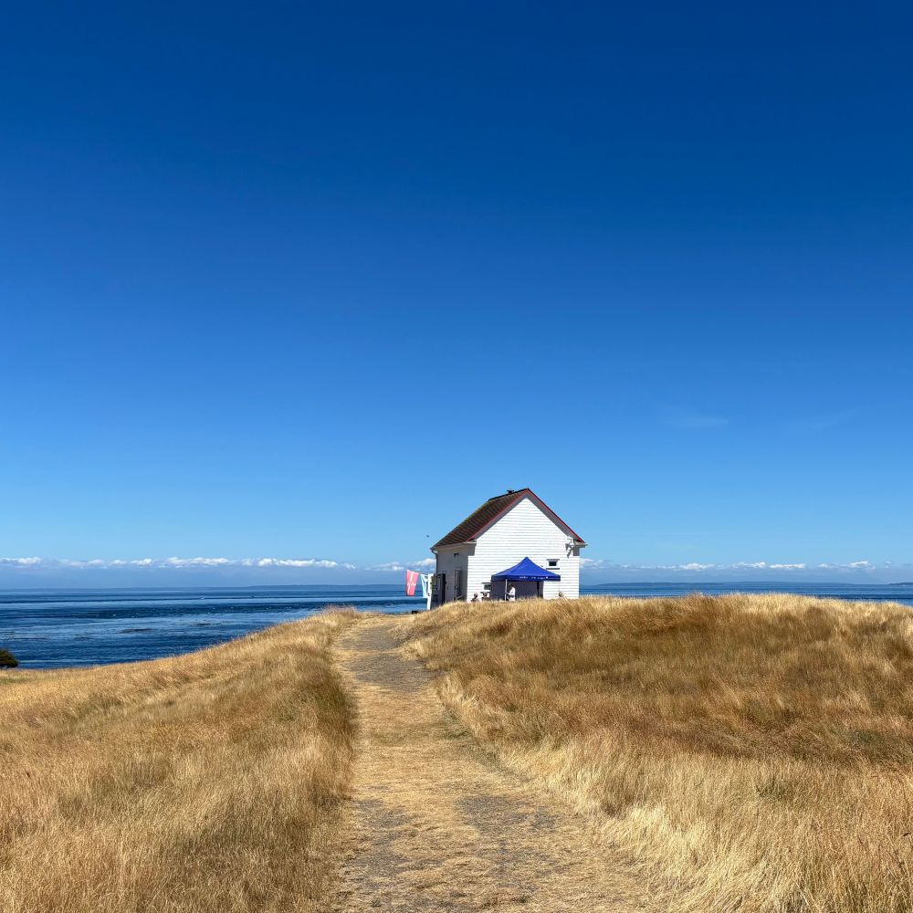
Notably the new flag lacks the 🍺 of the old one, but for reference, it is a rendering of the FAB - a heritage building on East Point- the easternmost point on the easternmost Gulf Island.

My question is, was it a novice graphic designer or a professional graphic designer that worked on that? Because design was clearly involved.

It's too "busy" for my liking

Prefer the new one. Haven’t been to Saturns in ages. I really need to fix that. I mean it’s just right over there 👉🏻.
Saturna* autocorrect demons away!
That's a really nice flag!

