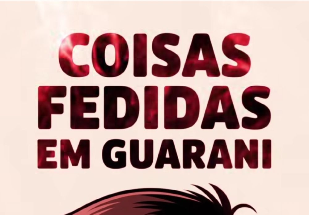
The font. Most AI text has a very distinct weird font. Can't tell exactly how to spot it, but I can see it clearly
Replies
It... just looks like 400 weight Lbire Franklin? Like the kerning's a bit off but it looks like a normal font. The bad perspective just looks like a bad Photoshop job. I have seen older AI generated text before and it does seem similar. But also haven't the models gotten better at text?
sep 1, 2025, 4:53 pm • 0 0 • view
Yeah, this really looks like some normal font, but it's that AI generated text almost always looks like this because it's the kind of typeface it best knows how to replicate. Look at these images (taken from a Guarani language learning page). All three of these are AI gen, maybe what I'm getting is+
sep 1, 2025, 6:39 pm • 0 0 • view
+ really the *off* spacing between letters
sep 1, 2025, 6:40 pm • 0 0 • view
The first one is to show that every time AI tries to do something different, it fails more obviously
sep 1, 2025, 6:40 pm • 0 0 • view
*Libre Franklin
sep 1, 2025, 4:53 pm • 1 0 • view


