Found an old folder of Bad Graphs! From my data-loving heart to yours 1) check your axes and labels 2) check your range and scale 3) check for gaps Don't let liars scare you! Stay safe out there.
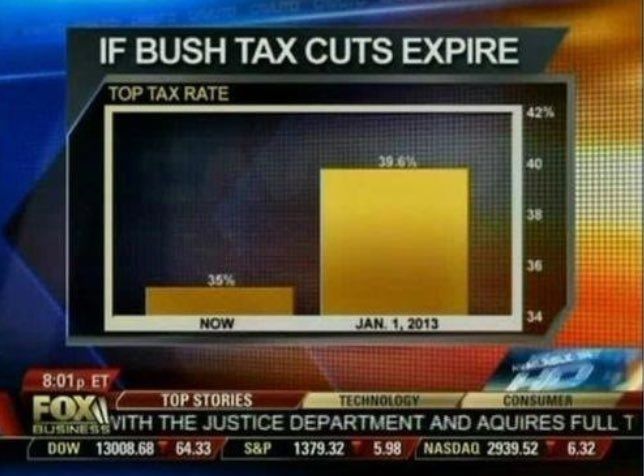


Found an old folder of Bad Graphs! From my data-loving heart to yours 1) check your axes and labels 2) check your range and scale 3) check for gaps Don't let liars scare you! Stay safe out there.
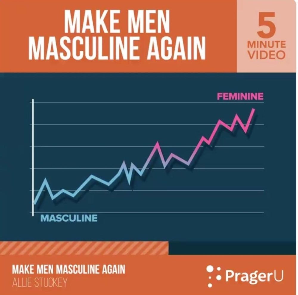
More ludicrous scare graphs. One thing is so much bigger! The line went up so much it's pink!! Oh no!
![Screenshot of an old Fox News broadcast, depicting a flawed, manipulated graph. The label says the vertical bar graph shows, via the 2011 Census Bureau, [number of Americans on]](https://cdn.bsky.app/img/feed_thumbnail/plain/did:plc:rnr6ous5qbssg33hrhraomfg/bafkreigxz4qc33uci2aeujtqg62nlwundrv53rq5yrzjh2dgzu2o4ij4vm@jpeg)