
Metra is proposing a rename of all their regional rail lines. metra.com/newsroom/met...
Metra is proposing a rename of all their regional rail lines. metra.com/newsroom/met...

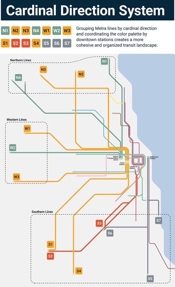
As a visually impaired rider, I believe the proposed Cardinal map with color-coded lines that indicates the relationship to the city stations is far superior to the current map and the “M” system.
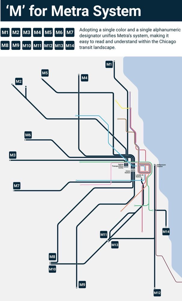
The M map is hard to distinguish, and with all lines the same, dark color, I believe even fully-sighted riders new to the system will get confused and not realize the trains go to different stations. The differentiation in colors reinforces that point.

omg please! This would make things so much easier! The naming scheme is really confusing if you’re not familiar, and especially given that both the CTA and Metra are color-coded but only one uses the colors to name. I’m tired of correcting non-locals that the UP-N is not the Green Line, for example

I honestly prefer the terminal color with the directions and a number. Calling everything M and using the same color makes it hard to differentiate.

Honestly, just the "M" system would be better, especially since a lot of systems usually do a clockwise system for numbering lines, so you'd kinda know roughly which way you're going anyways If they were to group it, I'd think grouping it by station would be better than by Cardinal direction

Toronto's GO network generally uses the city/major town near the end of the regional rail line as the route name, ie Kitchener, Barrie, Stouffville, Milton. This provides general geographic direction. As well, GO's now added 2 letter abbreviations of each line for quicker reference on screens & txts

M5 M7?!!? WE'RE NOT IN LONDON YOU ABSOLUTE PENIS
I like the M(number) option, it's very easy to understand and easy to put on a map. Hopefully that means the CTA would join in and go L(number)

…and hopefully the South Shore Line joins in too and goes S1/S2 or S15/S16 for its main line and the West Lake Corridor.

Colors aren’t the most accessible to folks with colorblindness. So I’d be more apt to support a letter-number system.
The colors are just proposed and could be adjusted (although I think they are quite clear), but as a visually impaired person, I think they reinforce the fact that the line s end up at different downtown stations. I think the Cardinal map is far superior to the current one and the M version.

nooo wheres the flavor