realizing I didn't post the second color 🤣🤣

realizing I didn't post the second color 🤣🤣

Ooh. I love a sagey olivey green. I’d send you our colors but my phone pictures aren’t reflecting the real color at all.
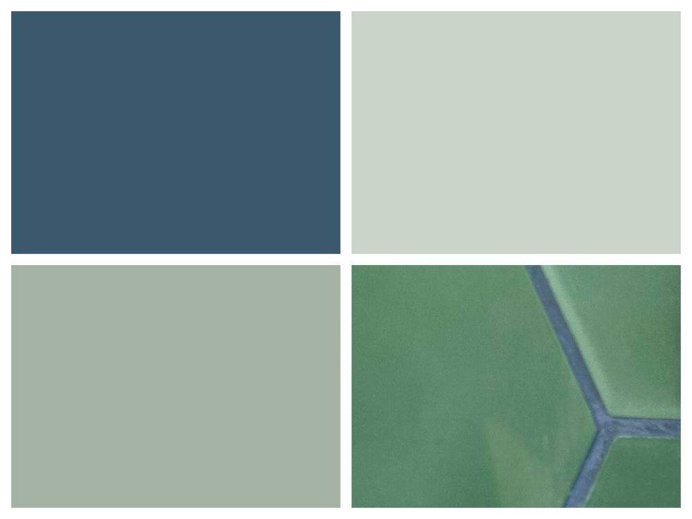
these are screenshots from the paint manufacturers. The second one was what we painted our prior bedroom (and will again here). It looks less yellowish irl.
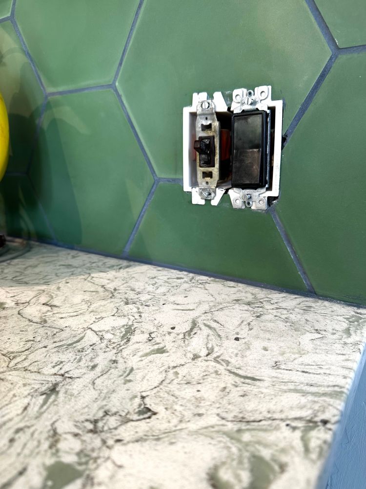
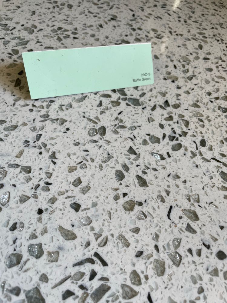
The countertop is one of those sparkly quartz types. Not my fave but it was recent and in good shape. The sparkles have a tendency to look silvery / grayish, painting the cabinets green will hopefully bring out that more "sea glass" type tone in it.
We literally put in sparkly quartz countertops with a sea glass green in it. And the green absolutely does help it come out.
Thank you for my external validation! 🙃
I’m excited for you!
Well it's not yet, lol! But eventually. Looking forward to your pictures also!
very bold! This is our countertop. The sparkles always look darker in photos.
I am jealous of the courage to go bold. I am good at bold accents (eg furnishings and pillows and such) but shy away from it on walls. Admittedly I am not great at visualizing, and it's easier with the more muted / pastel tones.
I tend toward an accent wall and bold accents but in the kitchen I just wanted color and NOT WHITE OR GRAY.
Here are the colors from the website. The blue is the lower cabinets. Lighter green is walls and uppers. Darker green is trim and then the tile is green with dark blue grout and some white stars.
gorgeous
It’s been so satisfying seeing it actually realized. It was one thing on swatches and in my head. But it actually works. The room looks so amazingly different and so much better.
These kinds of changes are always fulfilling - inevitably you end up wishing you'd done it sooner! We'd do a makeover now if it was in the budget... that will have to wait a while. Paint is cheap. Cabinets and countertops are not!