I think I used this font on our wedding programs…
I think I used this font on our wedding programs…

Was your wedding at a deli?

What deli are you going to that uses art deco fonts?
The ones in New York, mostly.

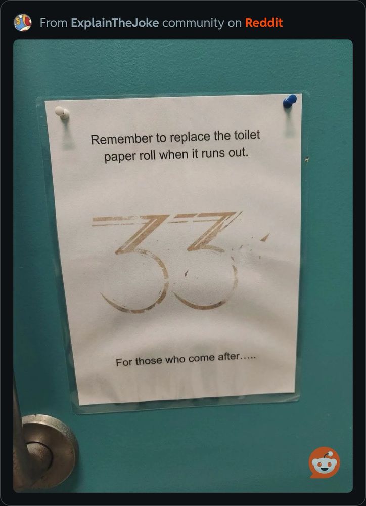
To have and to hold, In plumbing and in HVAC…

Till flush doo us part

+
Great Shatsby vibes

[P] Your wedding program was a toilet?

Shart Deco

Caviar Dreams - DaFont ᵈᵒᵗ com
Graphic Designer*

W doesn't match
Dang, you're right. Foiled again.


Dearly beloved, we are gathered here today to celebrate the fact that someone finally flushed the damn toilet correctly.

Keeping the can classy

I think I used that wording on my wedding invitations. They were very wet envelopes
Why would you use toilet language for your wedding program…?

isn't this the bioshock font or am I misremembering
Bahahahha what a good callout

classy ass shit

Frank Lloyd Wright is rolling in his grave like a steam engine 😂

Very Gatsby
Perhaps don't tell her how this broken toilet reminds you of your marriage though 🤔

From toilet to wedding programs. Funny juxtaposition. :)

I think thats a testiment to the variability of the font!!

Reminds me of a friend of mine. First time I visited their house, the toilet was broken. You had to pull the chain manually. He was getting married in a couple of weeks, so their wedding gift from me was a new toilet. "Shitty" gift, but at least I know it didn't gather dust in a cupboard never used.

classy (in both cases)

Lubalin Graff?
Nah, this font is Sans Serif. Lubalin Graff has lots of serif action

Yes, very nice font. But you could probably just fix the toilet with less effort than it took to make the sign. 😄

I need to find this place and tell them they need to shorten the chain going from the tank lever to the flapper. Seriously, I will not be able to sleep.

This somehow reminds me of that whole drama with Papyrus and the title cards for James Cameron's Avatar movies...

Good fonts deserve to be seen everywhere...
Although "good" is always going to be contextual.

It makes me think of The Great Gatsby for some reason.... old chap.

Nooooo, not the flushing instrutctions font on the wedding programs 😭

Think it would be great on a gravestone?

As someone with mild dyslexia, those type of fonts (where there's no kerning/spacing between the letters) are a nightmare to read.
I don't even have dyslexia (that I know of), but I think the same thing - especially for a note like this that should be very, very legible for everyone who sees it!

Ah, yes... Font # 2. A classic.
Toilet, heal thyself.

Shart Deco

Who says good fonts need to have limited uses?
papyrus..
I said good fonts not abominations
No kerning? Dislexia nightmare? Kitsch?

Great Gatsby themed...

Same spirit? 😅

on closer inspection... not a very clean piece of sanitary furniture.

Ohh I definitely used something similar for my wedding

🎉🎉🌟💫

hard to read

Quite the impact they've had on the world! Good show, ole boy!