
Here's an updated view of the 12-month running mean global temperature, which is a simple metric that provides insight on climate change and climate variability. + Graphic from global climate change indicators: zacklabe.com/climate-chan...
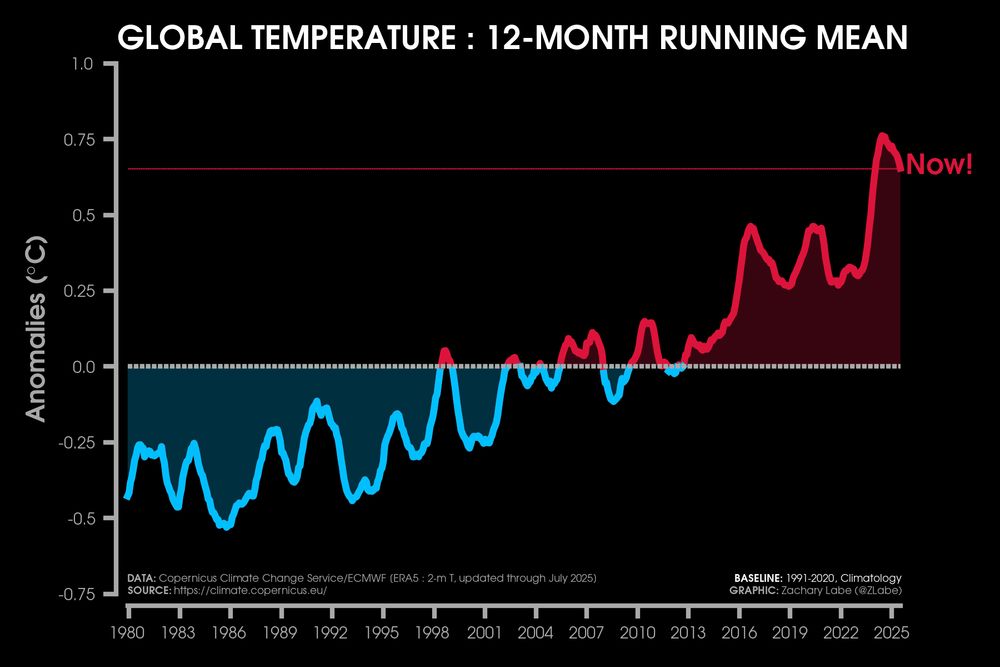
Here's an updated view of the 12-month running mean global temperature, which is a simple metric that provides insight on climate change and climate variability. + Graphic from global climate change indicators: zacklabe.com/climate-chan...

Can you do this on an 18-month running mean, please?

concave upward

Nice to see you here.

Also wondered why 2020 was so warm compared to 2017, 2018, 2019, 2021, or 2022. Like it was a LaNiña year at the bottom of the 11 year solar cycle yet still tied 2016 - an El Niño year at the start and not during a grand solar minimum like 2020 - as the warmest year on record (3rd now) via NASA GFSC