avatar
Zack Labe @zacklabe.com

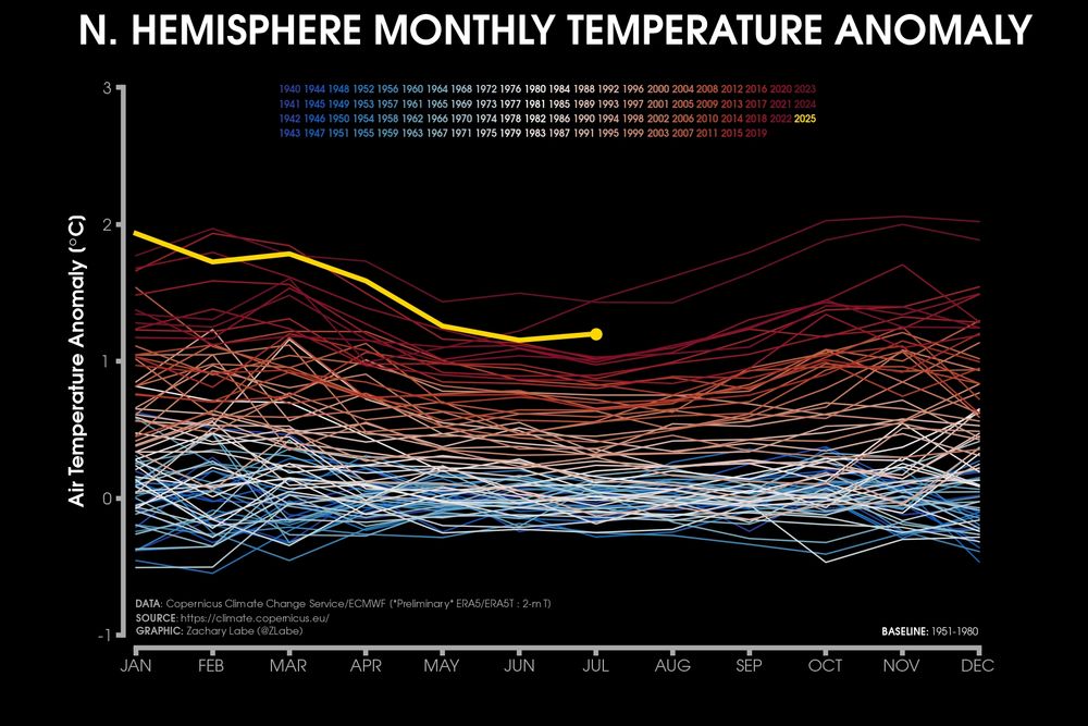
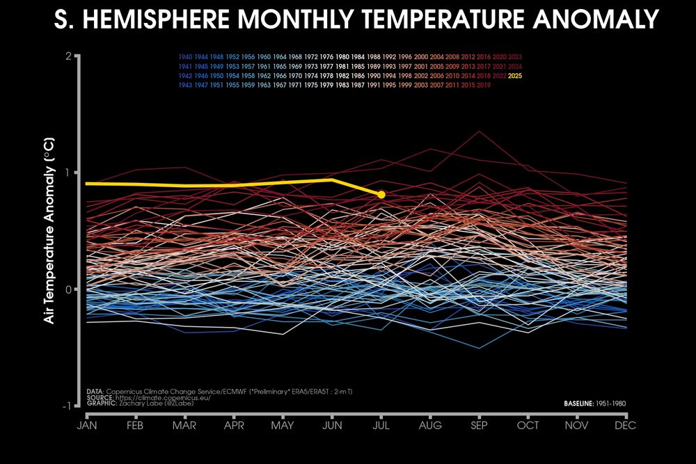
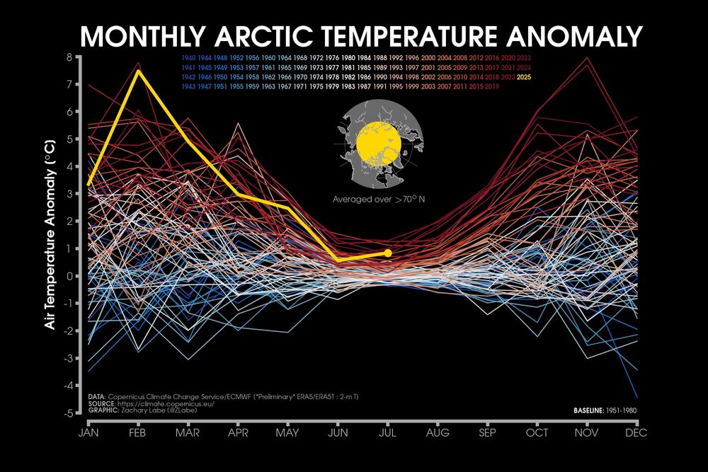
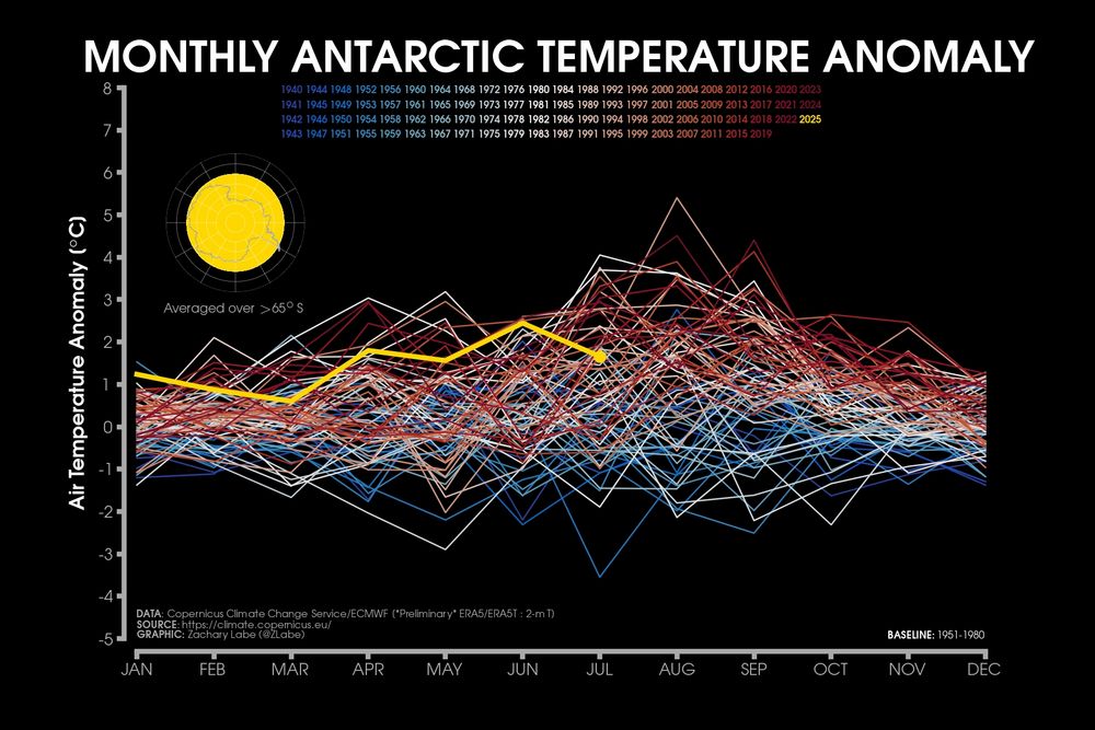
Comparing the different seasonality and trends in the magnitude of monthly temperature anomalies since 1940 for the Northern Hemisphere, Southern Hemisphere, Antarctic and Arctic. There are significant differences in the rate of long-term warming (blue to red lines). Data: doi.org/10.24381/cds...

Line graph time series of monthly mean surface temperature anomalies for the Northern Hemisphere region only. Every month is shown from 1940 to July 2025. There is a long-term warming trend in all months of the year. Line graph time series of monthly mean surface temperature anomalies for the Southern Hemisphere region only. Every month is shown from 1940 to July 2025. There is a long-term warming trend in all months of the year. Line graph time series of monthly mean surface temperature anomalies for the Arctic region only. Every month is shown from 1940 to July 2025. There is a long-term warming trend in all months of the year and a strong seasonality in terms of the magnitude of the anomalies. Line graph time series of monthly mean surface temperature anomalies for the Antarctic region only. Every month is shown from 1940 to July 2025. There is a long-term warming trend in all months of the year, but less obvious than the other regions.
aug 26, 2025, 8:05 pm • 45 20

Replies

avatar
The Green Onion News @thegreenonion.bsky.social

image
aug 26, 2025, 8:47 pm • 0 0 • view