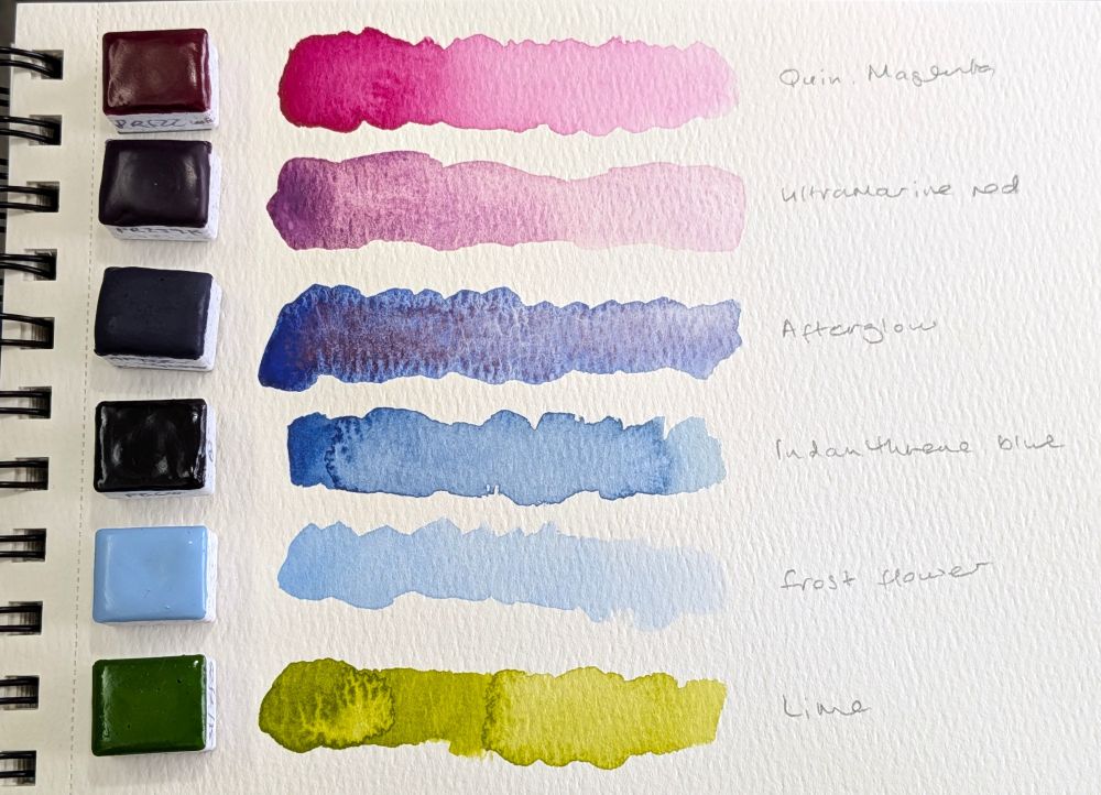
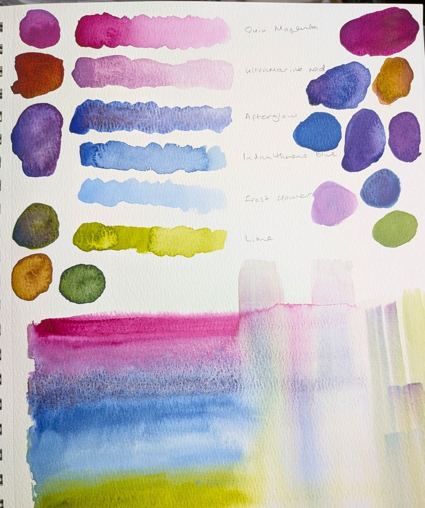
It gives lovely English-cottage-garden vibes. And I think subbing the yellow for the green maybe wouldn’t initially look as harmonious, but I think it would be more useful in the set.
Thanks! 😁
One thought is that swapping the green for PY74 Hansa yellow medium would make it a more useful set overall. And then you could mix that green from PY74 + PB60 indanthrene blue. 🤔
That was my thought, that a yellow would be more useful than the green.
Thinking I might do both, TBH... I just like that green in the gradient!
That green is delicious!
Me personally I would have taken out one of the blues and added another yellow, but they do look good! I love that sap or olivey sort of green in particular, and the purple/pink
I feel like I wanna keep those blues, but I could add the yellow and make it a bigger set. & Thanks for your help! 😁