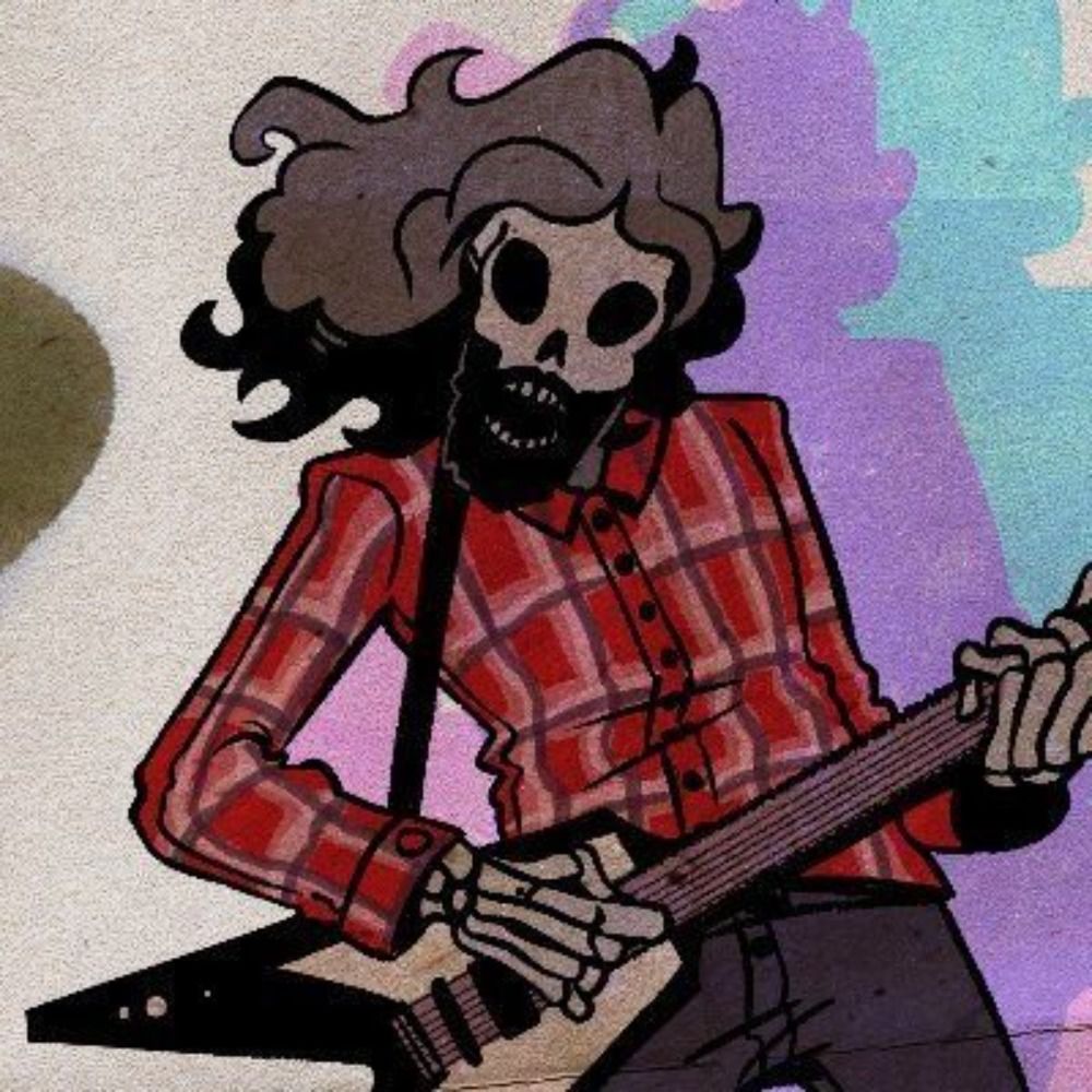
It definitely feels like they should be closer together or it should be a wider shot so the space between looks smaller or something
It definitely feels like they should be closer together or it should be a wider shot so the space between looks smaller or something

Wider shot would probably be the best. Leave some space between the figures and the edge while compressing the space between them.