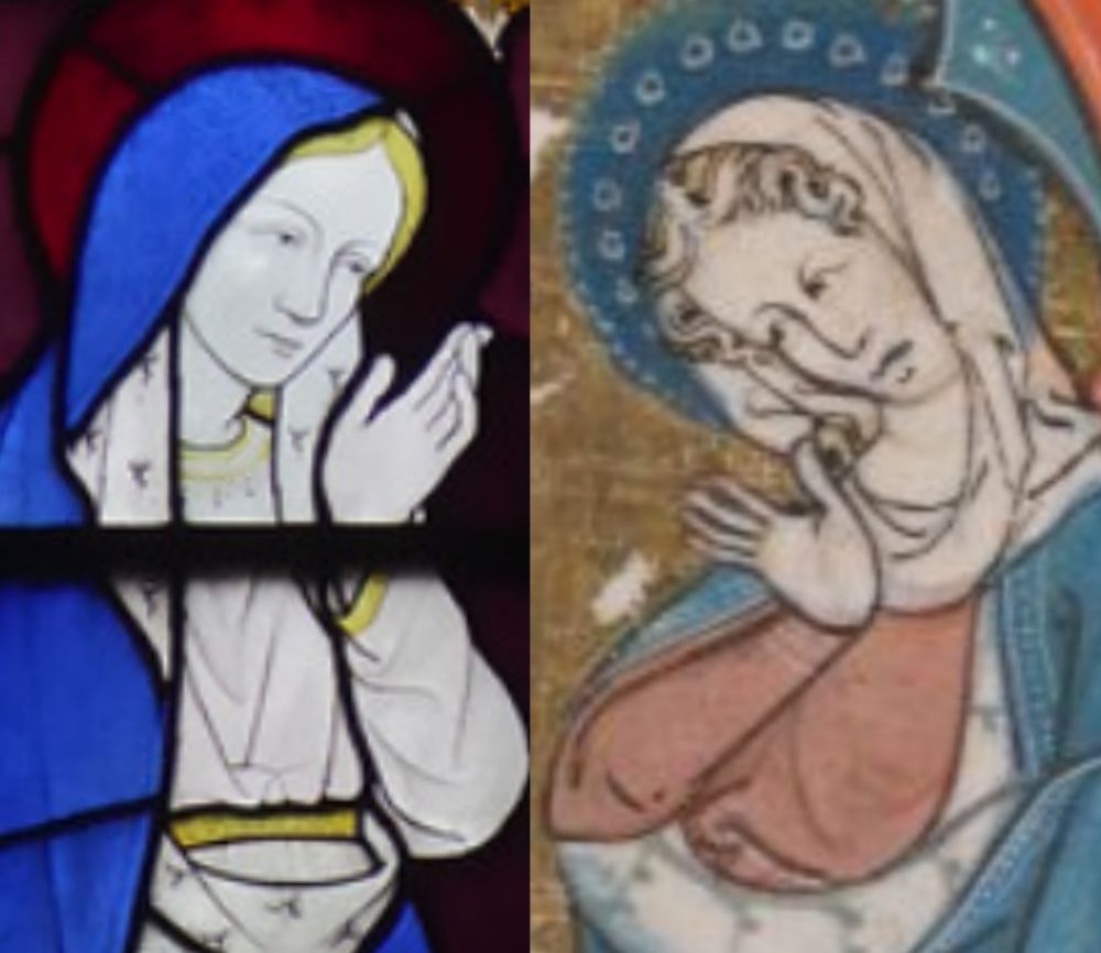
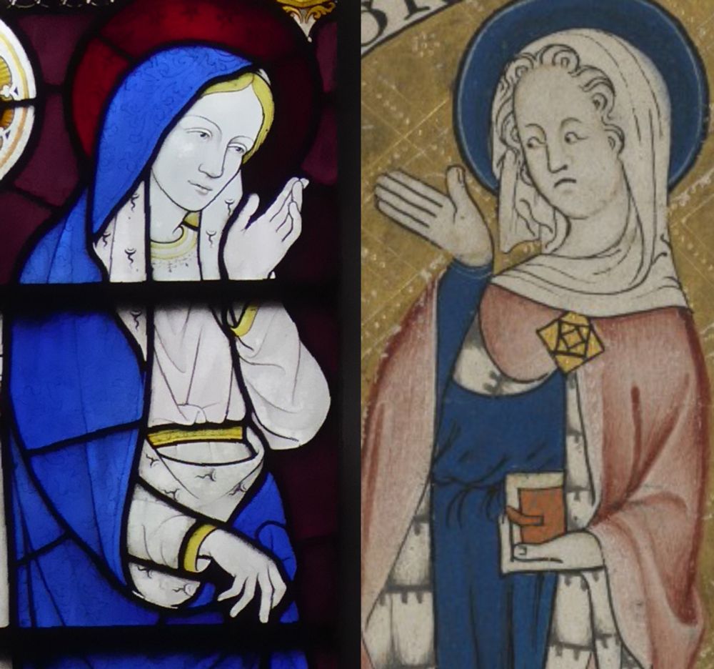
You might try looking through work by artists linked to William Morris and the Kelmscott Press. Ultimately that derives from medieval manuscripts too, of course, but through a Pre-Raphaelite filter, and because they emulate woodcuts, it all has strong linear contours that translate easily to glass
Thanks for the suggestions. I will explore. Comper uses a range of sources from different periods and mediums. That he's directly influenced by illuminated manuscripts is evidenced more by a range of examples. I've yet to do his angel's wings here are two others. bsky.app/profile/mark...
bsky.app/profile/mark...
oh and the juxtaposition of strong colors plus grisaille/silver-stain is closed linked to 15th-16th century glass, especially Cologne and surrounding regions, so that's another place to look for sources. Compare the colors in this late medieval panel, for example: www.metmuseum.org/art/collecti...
Or here -- it's that balance of white silver-stain glass pieces in some areas (now grayed with time), and then those deep blues, reds, etc.: www.metmuseum.org/art/collecti...
Thanks. Also how the colours are often abstracted down to one red, one blue, one yellow. He used German engraving of the period (Schongauer & Dürer in particular). Yes, I'll explore further. You might be interested in his use of medieval stained glass. bsky.app/profile/mark...