
It's amazing that you could be so smooth brained to look at these two logos and think "holy shit! they've completely changed the logo! MUST BE WOKE!"
It's amazing that you could be so smooth brained to look at these two logos and think "holy shit! they've completely changed the logo! MUST BE WOKE!"
Make the logo great again?
This whole situation is one of the dumbest so far this year. 1. I can’t believe people were pissed that CB was refreshing the brand with (checks notes) comfy seating and white washed walls. 2. That they abandoned their multi million $ plan to implement these changes bc some snowflakes
I’ll have to take your word for that bit about the interior design changes. The only relationship I have with Cracker Barrel is through my sister-in-law and her partner who park their RV in its parking lots when on road trips.
From this to this: Literally looks like every white suburban girl farmhouse kitchen dream.


HGTV board and batten (the trendy follow up to ship lap).

I’m telling you, if they went with an actual buckle rather than the flat design, this would have never been an issue.

My parents used to love this chain & we'd go to be polite & spend time with them. Thing I noticed. All the stuff they hung on the walls...interesting but probably hadn't been dusted since placed. 1/8 inch of dust. All that accumulated grease,dust & mites was being blown onto your food...
Classic examples of logos gone woke over the last century. (ps. HEY PEPSI! GO BACK TO "BRAD'S DRINK" you hippies!)


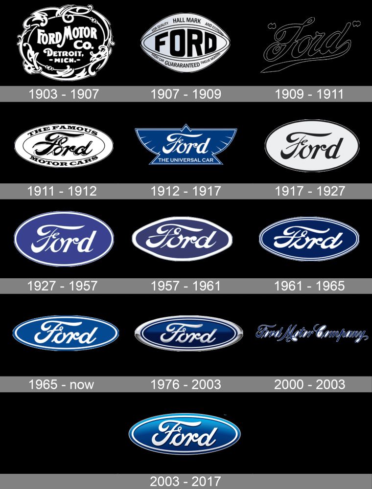
Shell really nailed that first woke logo move though.
True. 1948 logo slaps tbh
If someone is that consumed by a logo change...They clearly don't have enough real problems to deal with...
I think the new Cracker Barrel logo is supposed to be one of those belt buckles gay cowboys wear.
big if true!